Emmet Re:view
A browser extension for displaying responsive web-pages in a side-by-side views to quickly test how it looks at different resolutions and devices.
A browser extension for displaying responsive web-pages in a side-by-side views to quickly test how it looks at different resolutions and devices.
Displays resizeable view for each CSS media query breakpoint of your page. Contents of large viewports are dowscaled to fit your screen size.
All views are fully synchronized: scrolls, form field fills and clicks, even mouse interactions like movement and hover.
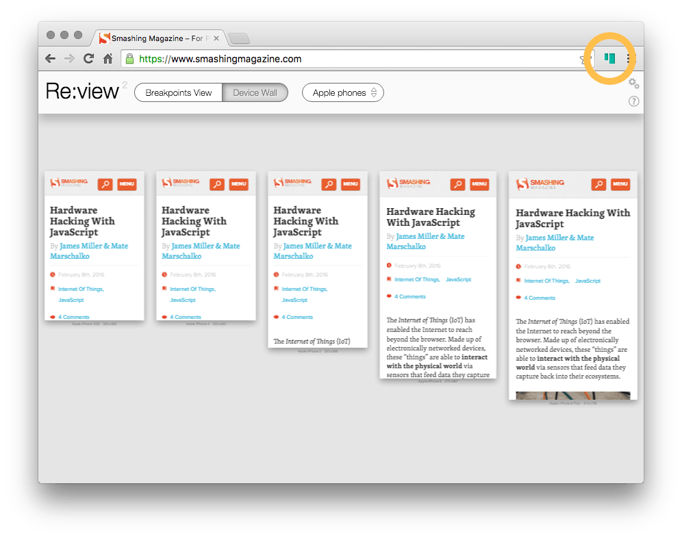
Bird’s-eye overview of device-sized viewports. Each view is scaled according to <meta name="viewport"> tag of your page and overrides User-Agent with real device value.
In Device Wall, hold down Shift key to enter control mode (screen edge will glow green): use mouse wheel to zoom in/out, drag view to pan around.
If you don’t see glowing edge while holding Shift key, click somewhere on the page outside of responsive views and try again.
In Google Chrome, go to a web-page with responsive layout.
Click on a browser icon to enable Re:view.
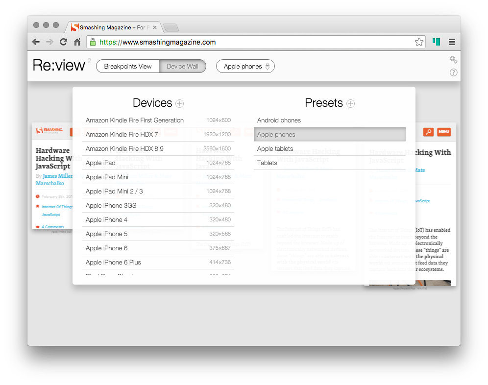
Switch between display mode, pick any existing device or preset or even create your own ones!